There are other texture alignment grids available. Each has different features, you might prefer a different grid to this one. But if you've never used an alignment grid before, you'll find that using any grid at all makes a huge difference!
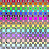
In today's blog entry, I'll explain how to use it. First, though, here's a look at the pattern. You can pick up a free copy for yourself at my store in Kuma or on Xstreet SL.
Aligning textures so they match up perfectly can be a big headache. When building, you often have prims of different sizes, rotated in different directions. When you just drop textures onto them, they can look like this.
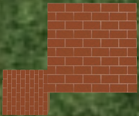
So you go ahead and try to fix it up. The tools for arranging the textures properly are all in the Textures tab of the edit window. You can rotate, resize (by adjusting the # of repeats), and offset the textures. There's even a tool for setting the exact number of repeats per metre, over your prim.
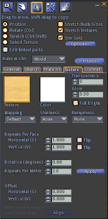
But the problem is that you're trying to align everything by eye, without any guidelines to show you when you're getting closer to the ideal or not. It's a bit like playing Twenty Questions without getting answers.
One very important note: you do not need to hit the Apply button, when you're using most of the tools. That button is only used when changing the repeats per metre, using the textbox to the left of the Apply button.
If you do hit the Apply button when doing anything else, you actually change the repeats per metre to whatever was in that textbox - which usually messes up everything you had been doing.
Ignore that button!
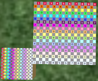
To use the texture alignment pattern, first place it on the prims you want to align. In this example, I have one prim that's twice the size of the other, and rotated at right angles to it. This is a common situation - especially if you're using hollow or other prim shaping tools.
If you want to actually do the texturing for this tutorial, the large prim's textured face is 2m square, the small prim is 1m square. The small prim is rotated 270o around from the large, and its centre is exactly 1m down from the large one.
The brick texture is the Library texture 'Bricks', found in Library->Textures->Buildings.
A set of prims for this tutorial are packaged with the texture.
To adjust one face of a prim, mark the 'Select Texture' radio button, then left click on the face you want to select. This makes the tools in the texture tab apply only to that face.
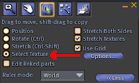
To put a texture on just one face of a prim, use Select Texture, or drag it from the inventory onto the prim face you want to adjust.
Once you have the alignment grid on the prim faces you want to align, you rotate the texture, adjust the repeats, and adjust the offsets. Technically, you could do these in any order you wished, but I find it easiest to rotate, then adjust repeats, and finally do the offsets. So that's the sequence I will use in this tutorial.
If you have a skewed, twisted, or sheared prim, you will notice that default mapping produces skewed, twisted or sheared textures. This skewing, twisting and shearing is particularly noticeable when you have the texture alignment grid on a prim face.
To fix the deformation of the texture, find the Mapping dropdown, and select Planar. This wraps the texture around the prim while ignoring the distortion of the prim shape.
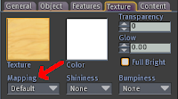
Don't use planar mapping for everything: it adds a slight amount of lag when the Second Life client displays the prim. Use default mapping whenever it works. But do use planar mapping when you need it.
Select one of your prims (or prim faces) to be a reference. Set the rotation, repeats and offsets to be whatever you want them to be - usually, they will be 0 rotation, 0 for both offsets, and 1 for both horizontal and vertical repeats.
Once you have the reference set, never change it. You'll be adjusting everything else to the reference: so changing the reference will mean changing everything you've adjusted - again!
In the tutorial, I'm using the large prim, top face as the reference.
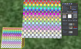
Select the first prim (or prim face) that you want to match to the reference. In the tutorial, I'm matching the top face of the small prim to the reference (top face of the larger prim).
I started with rotation. Looking at the two texture alignment grids, it's easy to see that they're at 90o to each other. So I adjusted the rotation of the smaller prim face by 90o. But I had a problem - at 90o it was upside down to the reference! I tried 270o, and it was perfect.
If you have a more difficult rotation, you can either compare the two prim face rotations and work out the mathematical difference between the two rotations, or you can rotate the texture on the prim face you're adjusting until the lines in the pattern are matched.
Next is the repeats. These are easier than the rotation, because you can figure out the size difference between the two prim faces, and multiply the repeats on the reference by the size difference to get the repeats on the prim face you're adjusting.
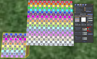
If you decide to adjust by eye, do the vertical and horizontal repeats individually, getting one right before you work on the other. Use the small squares as well as the big squares to get the match right, and check that it's right at both ends as well as in the middle.
Work slowly, and keep going in one direction (either more or fewer repeats) until the one where it gets worse. Then go back one step.
I did this one mathematically, because the smaller prim is exactly half the size of the larger prim. So the larger prim's repeats are 1 vertical, 1 horizontal, and the smaller's are 0.5 in both directions.
Finally, the offsets. You will see that in the image for the repeats, both the colours and the numbers are completely wrong.
Here is where Chosen Few's true brilliance shows. Each of the large squares is five of the small squares. Each number change is 10 small squares, or two large squares. Each colour change is 5 small squares/1 large square, as well.
When I have a pair of prim faces to adjust that aren't already large-square aligned, I like to do that. Then I can just hit the arrows until I have the correct colour or number, and if necessary, adjust by half a square so the grey square is next to the coloured square.
It sounds harder than it is. Once you actually do it, you'll see how easy it is.
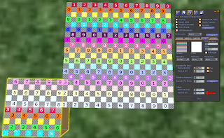
The smaller square in the tutorial is positioned next to the large one in a way that meant the squares were already lined up - I just had to get the colours and numbers right.
For the vertical alignment, I just hit the arrows until the colours lined up. I was lucky, a whole number got it positioned perfectly.
However, the numbers were wrong, and there was no grey square between the coloured squares across the sim boundary. (Or in the alternate lines, no coloured square between grey squares.) This means the horizontal alignment was wrong, and I needed to adjust it.
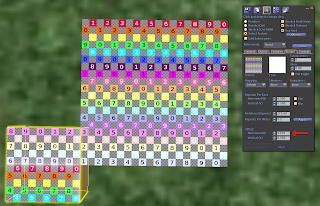
I knew I'd need a 0.05 correction to get the coloured/grey squares lined up (because 0.1 corrections had lined up the colour/grey squares, and each colour/grey square pair is twice the size of a single colour or a single grey square). So I put that in, then hit the arrows until the horizontal alignment was perfect.
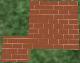
The final stage is to put the bricks texture on again. As you can see, the alignment is now perfect.


