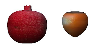
Lane Luke made these great fruits - a persimmon and a pomegranate. They look fantastic, don't they?
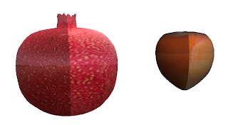
Now let's turn them around. Oops.
Lane asked for my help - and was generous enough to offer to wait while I made it a tutorial for everyone. :) Kudos for Lane! So let's use Lane's problem as an example for the common problem of texture tiling.
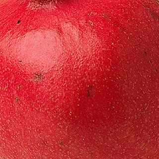
Here are Lane's textures for the fruits. As you can see, the right and left sides of the textures don't match at all.
Note that both the textures and the sculpts themselves belong to Lane. You are licenced to use the textures for study purposes, but not to sell either as textures or as part of an object. Please respect Lane's generosity in providing these as examples.
You can test the edges of the textures (if you use these ones) with a sphere: the results, while not identical to those in my 'final' images, will be quite similar.
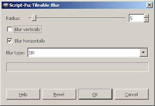
Back to the problem. There are several ways to fix the left/right disparity. One method is to use the Gimp's 'Tileable Blur' feature. You find this in "Filters->Blur->Tileable Blur". For this purpose, you want horizontal blur only (we're not trying to wrap the top to the bottom, just the sides to each other).
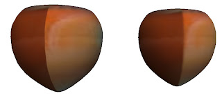
It helps, but not enough. A wider blur will help more, but will also blur details in the fruit texture. Using the tileable blur tool is always a tradeoff - it's up to you how much you want to trade.
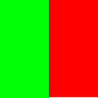
But there are other options.
The one I prefer is fairly simple in concept. I divide the image in half right/left, and swap the halves.
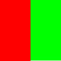
This puts the bad edges together in the centre of the image where I can play with them with smudge and blur tools and smooth them out to make them look right.
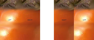
Here's the persimmon, first straight, then swapped, so you can see what I mean.
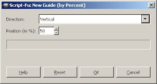
To swap them, first grab a guide with "Image->Guides->New Guide (by percent)".
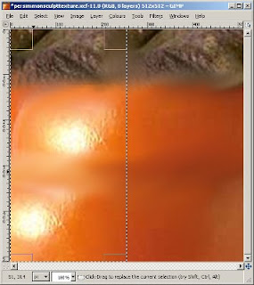
Use a selection rectangle and let the rectangle snap to the guide, then select the entire left side of the image. Copy the selection, then paste as a layer with "Edit->Paste as->New Layer".
Then do the same with the right side.
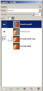
Your layers dialog should now look something like this. (Note that I have two copies of the original image - I always keep a second copy, in case I screw up. It means I can always start fresh.)
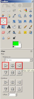
Select the alignment tool. Click on the left half-image, and use the alignment tool to push it right. Do the same (in reverse) with the originally-on-the-right half-image.
One trick with the alignment tool is that it selects the topmost visible part of the image under the cursor. If you end up with the half-image you want to move underneath the half-image you've already moved, use the 'eyes' in the layers dialog to make the top one invisible while you move the bottom one.
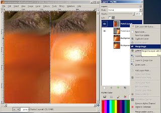
Your image should now have the right half on the left, the left half on the right. You should have two pasted layers in your layers dialog, one for each half. Right click on the top one of the two and select "Merge Down" from the menu that appears.
This will give you one layer, with each half swapped. Duplicate this layer (right click on the layer in the layers dialog, and select "Duplicate Layer") to ensure that if you mess up, you can just duplicate that backup and try again.
The guideline in the middle might bother you. (It often bothers me.) Go to View->Show Guides and untick it.
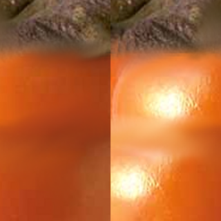
Now comes the part where if you don't have a drawing tablet, you decide to hit ebay and see if there's a cheap one. Mostly because this part is easier with a tablet than without one.
Study the image you're planning to make tileable. Look for patterns of light and shade, and decide where the light should flow across the border, and where the shade should.
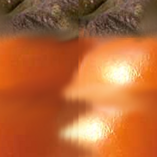
Using the smear tool and the largest fuzzy brush, roughly smear the light and shade across the border. There is no 'right' or 'wrong' for this, just whether it looks natural or not.

Using a smaller fuzzy brush, smooth some of the roughness in the early smears, and try to 'soften' the edges between shades of colour.
Upload this stage to SL (using the preview grid or the temporary upload feature of some of the third party clients) and see how it looks before you move on to the next stage. (Note: the 'seam' will be on the other side of the prim - you may want to either look at the other side of the prim, or offset the texture horizontally by 0.5.)

While this looks a lot better than the original, I think the lower dark patch has extended too far into the light patch. Personal taste. I'll smear that away. This sort of personal taste thing is why I recommend checking it in SL at this stage.
From this point, you just use smaller and smaller fuzzy brushes to smear the edges smoother and smoother until you like how it looks. You can also use the 'blur' tool, once you have the major colours in place and need only to blend the edges into each other.
In the detailed brown part at the top, only use the small brushes - otherwise you'll lose the detail.
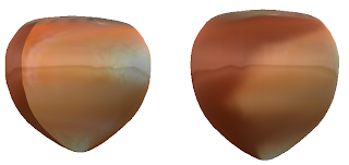
During this stage, upload to SL every so often until you're happy.
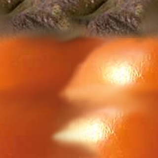
I can't give you exact instructions - it's very dependent on your personal artistic view.
Above are the original and final persimmons, and to the left is the final texture.
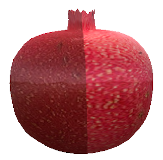
So now what about the pomegranate? Look at all the detail you'll smear away if you treat it like the persimmon!
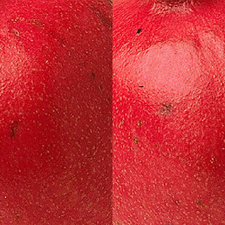
Start the same way. Split it in half, put the outer edges together. Get to the stage where the texture looks like this.
Now protect all that lovely detail. Duplicate the swapped layer, so we can play with it later. In the duplicate, go ahead and smear just like you did for the persimmon. Don't worry about losing the detail - we'll get that back later.
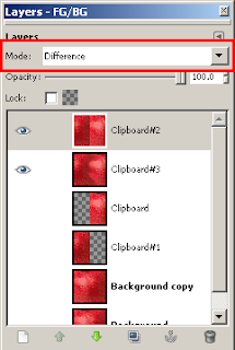
Once you're happy with the smearing, we can restore the detail. Move the original swapped layer above the smeared layer, and make both visible. With the original layer selected in the layers dialog, set it to the layer mode "Difference" (there's a dropdown menu at the top of the layers dialog). Select "Copy Visible" from the Edit menu.
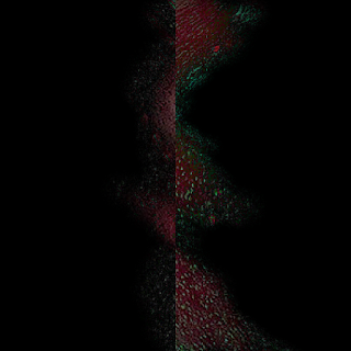
Use "Edit->Paste as->New Layer". Make the original swapped layer invisible again. The new layer you just pasted should be black, with reddish parts and greeny-white parts.
This layer contains - surprise surprise - the differences between the unsmeared and smeared layers. Which means it has all our detail! Unfortunately, it also has all the unsmeared background as well.
To see what we're going to do, set that new layer to 'Addition' mode. You'll see the original unsmeared version of the swapped layers show up. All we need to do now is remove the bits of red that replace the smears.
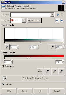
I wish it was as easy as just selecting the red parts out - but set the new layer back to 'Normal' mode and study the red. In some sections, the detail is all different shades of red. I experimented with a bunch of options, and here's what I came up with.
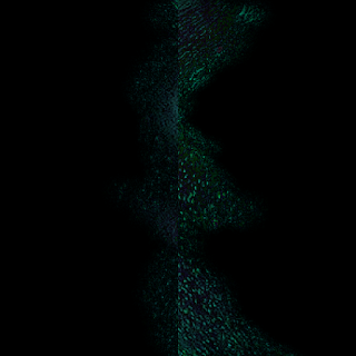
Go to "Colors->Levels". Select the Red channel, and play with the input and output levels. This removes the red tones, bringing them down to blacks and greens. You want to get as much of the reddish background to black as possible, while leaving the detail in greens and pale tones.
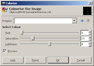
Now we make this reddish again (the former background red will stay black, only the greenish/whitish bits will go red). Go to "Colors->Colorise" and change the hue down to a red shade - somewhere between 0 and 15. To keep this from becoming intensely bright, bring the saturation down as well. I chose 20.
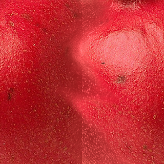
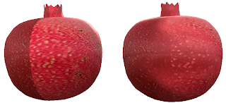
Finally, set the mode to Addition. This should give you a pomegranate texture with lovely detail and smeared-out lines.
There is still one minor problem: you will notice some slight seaming where the details abruptly change. Fixing that has to be done the tedious way of zooming in and using cut/paste or pencils/paintbrushes to put details from one side of the seam into the other side of the seam. But at least you have most of the work done!


No comments:
Post a Comment