Now in part three, we will learn about highlights and shadows. Wrinkles and folds are made the same way as highlights and shadows, but will be a tutorial of their own.
Open your Tutorial Shirt file that you made in part two. If you prefer, you can open anything you wish, but this tutorial will assume you have a shirt at least somewhat similar to that.
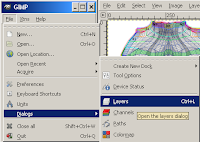
You will also need both the Layers and the Colors (or FG/BG) dialog. If your Layers dialog is missing, re-create it with Dialog->Layers from your Tutorial Shirt window, or File->Dialogs->Layers from the main Gimp window. If your Colours (FG/BG) dialog is missing, recreate that with Dialog->Colors or File->Dialogs->Colors.
Theory
The first thing to do is to look into the theory of highlight and shadow. The theory applies to everything you do - clothing, skins, tromp l'oiel (trick the eye) designs for building - everything.
A highlight is a place where the sun or some other light falls directly on a surface. This makes the surface appear paler than the surrounding region.
The shape, colour and intensity of the highlight is affected by the shape, colour and texture of the surface, and the shape, intensity, colour and distance of the light shining on it. Candlelight on a nearby mirror looks very different than sunlight on a velvet jacket.
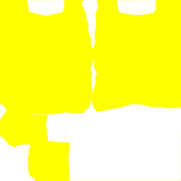
In a shirt, you normally find highlights around the collarbone, on the shoulders, on the top surface of a woman's breasts, on the top surface of a fat or pregnant belly, and (in a muscle shirt) on the top surfaces of very impressive muscles.
In the tutorial, we're going to assume that light is coming from above and slightly to the right, that it's a distant light source, and that it's a white light. Towards the end of the tutorial, I've written a brief section on other light sources and colours.
Open your tutorial shirt again.
The first step is to decide where the highlight goes. I usually do this with a couple of contrast dots or smears on a new layer - so make a new layer. Call it 'Highlight Guides' or something similar.

We'll put a highlight on the top surface of the breast for this shirt (the placement for this is more forgiving than for the others), so on the new layer, put some red smears on the top surface of where you think the breast is. Since we're assuming the light source is slightly to the right as well, have them curve slightly to the right side of the top. See my smears for guidance.
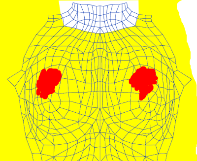
You can use any drawing tool for this - I used the paintbrush. Don't bother about making it look pretty, it's entirely for you & won't be in the final product.
Upload them to your avatar-clothing-checking-tool (see Part One) and check that the smears are in a good place. There is no perfectly right place, just one which looks good to you. Keep adjusting the position until you find one that works for you - it usually takes me several tries, and I'm experienced at it.
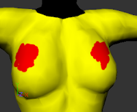
Now you're ready to start adding highlights! In this tutorial, I'll show you several different methods - as you get practice and get used to the techniques, you'll use different methods for different purposes.
Airbrush
Start by making another new layer, this one called Highlights: airbrush. Select the airbrush tool, and select white as the colour. We'll start with making white highlights, then I'll show you how to make pale yellow highlights with the airbrush instead.
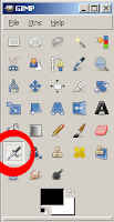
In the settings section of the airbrush dialog, choose a large fuzzy brush. Play with the scale, rate and pressure settings, and try to paint a white patch over your red markings, with the centre not being fully white (it should still show some red - or pink - through), and the outside being barely white at all. Try to make it fairly smooth. It's okay if you overlap your red regions too.
Using a lot of small, short strokes is easier than trying to use large sweeping repeated strokes. Small short strokes also lets you make liberal use of Ctrl-Z (aka undo). In fact, you don't even need to use strokes. I often just place the airbrush and click without a drag.
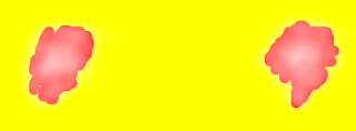
Don't worry if you can't get yours looking like mine. Blur, smear, and transparency will fix it a lot. My settings were a size 19 fuzzy circle, scale 1.54, rate 30 and pressure 7. Also, save your work several times during your painting!
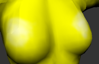
When your highlights are painted, click on the eye against the 'Highlight Guides' layer to make it invisible, and save your file to a png or jpg. Load it into your clothing previewer and take a look. It might look a bit like this.
Now make the highlights guides visible again, and make a new layer. Call it Highlights: airbrush yellow. We're going to compare the result of a white highlight with a pale highlight of the same shade as the main shirt.
To get the shade of the main shirt, we'll use the dropper tool. Select your shirt layer (mine is 'shirt base colour', and select the tool that looks like an eyedropper.
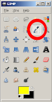
Go to your colours menu, and select the sliders tool. The S slider is 'saturation'. At present, the yellow is highly saturated - very strong. Move the slider about three quarters of the way to the left, to where it's very pale but still distinctly yellow. (There is no 'right' or 'exact' placement, just whatever looks artistically appropriate to you.) I moved mine to 30.
For some colours, you'll want to adjust V (value) as well as or instead of S (saturation). Keep H (hue) the same, though. Ignore the R(ed)/G(reen)/B(lue) sliders for this purpose: it's easier to adjust only the lightness or darkness of a colour if you use HSV. (RGB is great for other purposes.)
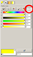
Now paint with your airbrush the same way you did with the white, getting much the same effect. When you try that on your clothing previewer, you should get something rather like the image to the left. The pale yellow produces highlights which are weaker than the white highlights. (You may have noticed as you were painting over your red that it produced an orange/yellow tint. You can use coloured highlights to simulate a coloured light source. That's an advanced technique, but this is how it's done.)
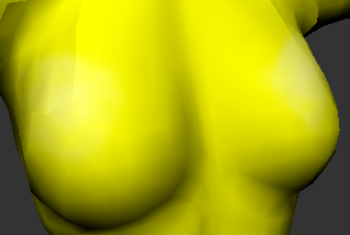
You can make the white highlights weaker quite easily, if you want to. Simply go to the layers dialog and adjust the opacity. If you turn the white's opacity down to about 70%, it should be similar in strength to the yellow highlights.

If you're not happy with how smooth your highlights are, you can use two tools to fix that. They are the blur and smear tools.
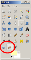
The spot on the left is what all three looked like. The middle one has been repeatedly blurred, the one on the right repeatedly smeared. I make use of both blur and smear to help smooth everything - highlights, shadows, wrinkles, any edge that I don't think should be sharp - anything.
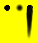
Don't forget to play with the settings. Opacity, brush type and (for blur)scale are particularly useful. In Blur, 'Sharpen' is a kind of anti-blur. Make a spot and play with repeatedly blurring and sharpening it to see what both do.
You really do learn best by playing with the settings. Turn them up and down to max while playing, but when actually using them on something you want to sell, be sparing with how far you push the slider.
Spend a bit of time using blur, smear, and the transparency setting to get your airbrushed highlights looking kind of nice, then we'll move on to dodge and burn.
Dodge and Burn
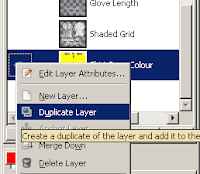
While the airbrush adds a new colour, the Dodge and Burn tools modify an existing colour. So for this, find the Shirt Base Colour layer, right click on it, and select Duplicate Layer. Use 'Edit Layer Attributes' (also in the right-click menu) on the new copy to rename it 'Highlights: dodge'.
Dodge lightens the image, and Burn darkens it. Naturally, this means we use Dodge for highlights, and Burn for shadows. Opacity, Brush, Scale and Exposure operate the same way they do for the Airbrush. Mode (with the Shadows, Midtones and Highlights options) is special: it determines which colours in a multi-coloured image are affected. 'Shadows' makes Dodge/Burn affect only the darkest colours, 'Highlights' only the lightest, and 'Midtones' everything else.
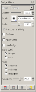
In my experience, you need to have Shadows selected to make Dodge affect a single-colour image; and Highlights for Burn.
Make your Highlight Guides layer as transparent as you can while still being able to use it to see where you want to put the highlights, and move it to above the Highlights: dodge layer.
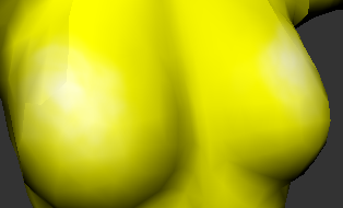
Then select the Highlights: dodge layer, and use the same sort of small strokes and painting pattern you used with the airbrush. Build up the same sort of highlight. You can use smear and blur with dodged highlights just as you can with airbrushed.
As with the airbrush, build up your highlights, save the file, save as a png or jpg and upload into your previewer to have a look.

There's a special trick I like to use to make the dodge/burn highlights and shadows layers contain only the highlights and/or shadows, however. I go to Select By Colour, set the Threshold to 0, select the base colour, and then cut that colour out of the highlights (or shadows) layer. This lets you use the Opacity slider and affect only the highlights (or shadows).
Layer Masks/Alpha Masks
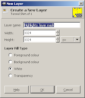
The Gimp also allows you to have selective opacity within a layer. So you can make a pure white (or pale-coloured) layer, then use a 'Layer Mask' (also known as an Alpha Mask) to make it selectively opaque.
Create a new layer, call it 'Highlights: layer mask', and make the Layer Fill Type white. Right click on that layer and select Add Layer Mask. Initialise the layer mask to 'full transparency'.
Now in the Layers dialog there are two squares in the 'Highlights: layer mask' layer. The left one represents the layer itself, the right one represents the mask.

To work on the layer, you select the left square. To work on the mask, select the right square. Confused yet?
Painting the layer produces the image in the layer. Painting in the mask makes certain parts of the image selectively visible.
The mask should be all black and white. The parts which are black become invisible in the image, the parts which are white become visible in the image. Like the mask is exactly that - a piece of black paper with white holes which reveal the image below the mask.
But the mask is smarter than that - you can use shades of grey. Dark greys are less visible, pale greys more visible, until you get to the ultimate black or white invisibility/visibility.

So we have a white layer, and we're going to paint the mask to reveal gradual amounts of the white.
(Yes, it would be just as easy to paint white on a separate layer of the image - but in future, you can use this same technique to selectively reveal a more complex image than a pure white layer. It's often used for a 'fuzzy border' effect in a photograph, for instance.)
So select the layer mask. The blue band should be across the Highlights: layer mask row in the Layers dialog, and the white border around the black layer mask.
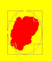
You need to paint white or shades of gray over the place you want the highlight. You can paint with the airbrush, the paintbrush, the pencil, the ink tool - anything you wish. You can use blur and smear to make it smoother. In this case, however, I'm going to show you yet another nifty trick.
Gradient (also Layer Mask continued)
Make the two colours in your toolbox black and white (use the little arrows to switch between them, and the colours dialog to select black/white as necessary). Go to ellipse select, and select a rough circle shape over one of your highlight guides.

Select the Gradient tool and the Radial shape. Click in the rough centre of your selection, then drag to a bit beyond the edge of it. This will create an invisible-to-you graduated set of shades of grey on the layer mask, limited to the selected ellipse. What is visible is the effect on the layer itself: a set of gradually more (or less) opaque white shades.
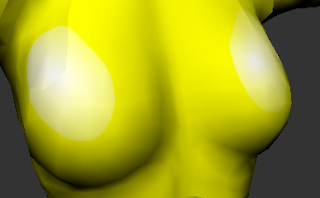
As you can see, this could use a bit of work with smudge and blur. But the principle is sound.
You can use Gradient as a tool on its own - it's not limited to use with the layer mask. Instead of going from black to white, however, go from the garment's base colour to white.
Eyedropper, Paintbrush, Pencil & Ink
As an advanced technique, once you have some practice using the automated blending tools, you can do your own blending. A useful trick is to use the gradient to make a nice long line of highlight colours (from the base colour to white), and then use the eyedropper to select different shades from the gradient. Then you use the paintbrush, pencil or ink tool to paint the shades in where you want them.
Make a new layer, transparent, labelled Highlights: hand painted. Make the two colours in the tool box the yellow of the base T-shirt, and white.

On a part of the layer that doesn't cover any of the UVs, make a rectangle selection.
Select the gradient tool, make the shape Linear, and drag from one end of the rectangle to the other. This will give you a rectangle of various shades of yellow, grading evenly to white.
Now you can use the paintbrush, pencil, and ink tool - or the other tools - and try to make a nice smooth even blended highlight like the other ones we created with the other tools. Use the eyedropper to pick up colours from the gradient rectangle you made.

This is something to use when you have a good eye for highlights and shadows, and can see that you need this exact shade in that particular place.
Shadows
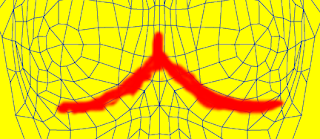
Shadows are drawn exactly the same way highlights are. Instead of using paler colours, you use darker. Black or dark gray instead of white and pale grey, deeper versions of the base colour instead of lighter, Burn instead of Dodge. For a gradient, draw from the base colour to black rather than to white. For the layer mask method, use a black or dark layer.
The shadow guides for the female bust should look something like this.
Other layer types

Don't restrict yourself to 'Normal' layers. If you look at the layers dialog, you will see that layers have a wide range of types.
The 'Soft light' layer type is great for highlighting - it produces a very vibrant look where the white is in the layer. Contrast that to the 'powdered' look highlighting with white can create.
'Overlay' is excellent for a highlight/shadow combination layer.
Create yourself a set of light and shadow layers and experiment - I don't yet fully understand what each of these is supposed to achieve (I'm still learning to use them myself).
The ones I'd recommend (at this stage in my own learning) for highlight and shadow effects are 'Overlay', 'Dodge', 'Burn', 'Soft Light', 'Darken only' and 'Lighten only'.
But play with the others. If for no other reason than fun!
Other light sources and colours
If the human body is being lit from below, the normal highlights become shadows, and the normal shadows become highlights. But most of the time in SL (or in other forms of art) clothing and skin is highlighted as if the light is coming from above. Often, lighting is presumed to come from a distant light source that's above, in front of, and slightly to one side of the item of clothing or skin. The lighting is also usually presumed to be white.
You can see this effect in RL by having a friend stand in a dark room, and turning on a lamp. Put the lamp in front of him and above him, and see what parts of him are most strongly lit, and what is most strongly in shadow. Then put the lamp directly in front of him but not above, and see how the lighting changes. Then below him. Then try with the light behind him, or to one side - just keep moving the light.
Clothing for Gothic and post-apocalyptic settings is often made as if the light is an unusual colour, and coming from an unusual direction. Some ethereal or faerie clothing is made with blue- or green-tinted lighting effects.
Get some coloured cellophane or coloured light bulbs, and experiment with lighting that patient friend of yours with different colours and from different directions. If your friend is really patient, get some more lamps and play with intensity of light and multiple light sources.
For an infinitely patient friend, use your SL avatar as the friend - you can make your lights by using the 'Light' feature in the 'Features' tab of a prim's Edit window. Plywood spheres make perfectly adequate SL lights.
Just make sure you have Local Lighting turned on in Edit->Preferences->Graphics (tick 'custom' to see all the options).
Move on to part 4, Seams.


9 comments:
Love the tutorial, very helpful. I'm having a problem with the fuzzy "halo". I have tried the layer mask, sharpen, I just cant seem to piece the tutorials that are for PS to Gimp. I have tried so many things to get this fuzzy to disappear. I didnt have a fuzzy neckline, armline, etc, with the basic t-shirt, but when i attempted to make one with more detail, coming off the shoulder, it appeared. I have a flickr account under this same name and pictures posted there. I also created a group on there called "Making clothes in Second Life using Gimp" for people like everyone that reads tutorials like yours and Robins. Sometimes more help is needed, for basic things that some just cant get a grasp on. If you have a flickr account, I would love for you to join, and anyone else that may be interested. I've used Gimp quite a bit, but just now getting into clothing. I love good quality, I just need to figure out this fuzziness! thank you much!
JennLynn Westland
I don't have a fuzzy halo, but I looked at your flickr account.
It looks like you're using an antialiasing tool on a layer that's white, rather than transparent. (If that's not it, let me know how you make that curve and I'll try to replicate the problem.)
You can see the antialiasing effect with the eraser - paint some stuff, then try erasing with 'Hard Edge' checked, and not checked. See the difference.
Antialiasing is the technique used to emulate 'smooth curves'. Because we're working in pixels - tiny little squares - we can't get true smooth curves. It's always going to be a little bit jagged.
Antialiasing fakes smoothness by using shades between the foreground and background colours to make half- and quarter-tone pixels along the otherwise jagged edge.
If you use an antialiasing tool to make a curve, and the layer you're doing it on has a 'background colour', the tool generates these half- and quarter-tones between your foreground colour and the 'background colour' of the layer.
If you use transparency as the 'background colour', the tool generates the partial tones as levels of opacity, instead of as blends of two different colours.
You can check whether a layer is transparent by looking in the layers dialog, selecting 'channels' (along the top, second from the left, tooltip says 'Open the channels dialog'); and looking to see if there's an alpha channel. If there is, you have transparency. Otherwise, you don't.
You can add transparency to an existing layer from the layers menu of the editing window. Mouse down to 'Transparency', then in the menu that appears on the right, select 'add alpha channel'.
If this isn't the cause of the problem, please try to tell me how to replicate the problem, and I'll work on it.
thank you for your reply. I did make this on transparency, also under channels there is red,green, blue and an alpha. I also tried to make a new alpha besides the one there and when i tried to save it would come up that i was trying to save an alpha as tga or png and it wouldnt save visible layers. However i did get it to save, and it had the alpha channel.
I made this curve using the path tool. I put my colors on the template and used the path tool to cut and curve the shirt. I have used sharpen, created a layer mask and colored the bottom layer the same color as the shirt, applied it and still the jagged white is there. I did go through my clothes today and wore lots of items that came from very expensive well known designers and it appears that they blurred the edges of thier garment, as it is a gradual blur out.
I just never though of this, of course I was wanting the crisp clean line. So i did blur on the shirt and noticed that when i had the layer mask on,it kindof cut the blur off to fast, still leaving a bit of a line. So Im going to blur on a new shirt, see if this is how it is achieved.
Any input I appreciate lots. I love high quality clothing, and I sure dont want to put any out that I'm not totally proud of, but i did use the path tool to cut this curve. I have looked at so many tutorials that you would think i would be an expert by now, lol, but far from it.
Thank you for having tutorials specific to gimp, so that lots of the guess work is left out!
You probably don't want to hear this, but the existence of that halo is confusing me. If you made it with the path tool on a layer that was transparent at the time - well, that's how I make my stuff!
(There can only be one alpha channel, which is why it wouldn't let you add an alpha channel/transparency to a layer that already had it. Just to clear that up - sorry I got you confused there.)
The off the shoulder curve you're making should work exactly the same as the neckline and arm-lines on the t-shirt. The fact that you didn't get the halo on the t-shirt should mean that using the same techniques, you shouldn't get a halo on the off-the-shoulder.
My suggestion at this point would be that you *test* your technique by making a completely new off-the-shoulder from scratch, with a new file or your starter file, ensuring that you have transparency (alpha channel) before you use the path tool. This is just as a test, not trying to salvage the existing shirt; checking whether there's something else wrong.
While you make the test, write down each stage. If the halo reappears, email me the steps and I'll see if I can solve the problem. My email is listed in my profile, or is my name (no space) at gmail.com.
If the halo doesn't reappear, we can presume that you didn't have transparency on when you cut the path, or some other wierdness occurred: but that you know how to prevent it next time. :)
If it doesn't reappear, email me anyway and I'll try to figure out a not-too-annoying method of de-haloing the existing top.
And for the sake of the readers, once we know what happened and how to fix/prevent it, we should summarise the results in another comment here. :)
JennLynn and I worked it out. There's a halo that shows in the previewer, if you're previewing clothing. This halo does NOT appear on the final product, not for either of us.
The fuzziness is antialiasing.
Hi! I know it's a bit late, but SL usually makes this white halo on clothing. I suggest reading Robin Sojourner's tutorial on white halo and the Solidify Filter for Photoshop, might help. There must be something like it for the Gimp, or maybe replicate the effect manually. Cheers!
Actually, as long as you make the cut on a layer with transparency, the Gimp doesn't have that effect.
The Gimp only gets it if you make the cut on a layer with a white (or otherwise coloured) background: at which point it's caused by antialiasing against that coloured background.
Both JennLynn and I discovered that the white halo she was seeing was antialiasing in the preview window, and did not show up in the final uploaded garment.
But yes, Photoshop people with the 'white halo' issue should definitely read Robin Wood's tutorial about alpha.
The white Halo effect is a pretty common problem among cloth designers, it happens for the same reason when placing a black sheet of paper of a white peice of paper, and cutting something out, then lay it on a table, and you will see the white sheet sticking out from the sides.
there are several ways to fix this problem.
one is to make the color part of the template larger then the alpha channel.
another way is to use the plug in solicify(don't quite me on spelling) by flaming pear, it a free download.
what i do is select alpha channel, by holding down cntrl, and left clicking the alpha channel. this will select the alpha channel. you will see ants now around you template colored areas. no in selection on menu select inverse, this will select the area outside of the template colored area.(the part that is meant to be transparent. create new layer and have it on top of all others, and last but not least. flood fill with black, or the closest color to the colors on your template.
this if done right should remove any halo effect, it is also the technique for use on a TGA file. it will not work on a PNG file.
Thank you, Jaimaz. I hope your techniques help many people!
Post a Comment