Friday, December 26, 2008

Texture Alignment Pattern

Chosen Few is one of the great texturers in Second Life. He very generously created a pattern which I use extensively to align my textures - and he made it free for everyone to use. He made the pattern available in a Second Life Forums thread.

There are other texture alignment grids available. Each has different features, you might prefer a different grid to this one. But if you've never used an alignment grid before, you'll find that using any grid at all makes a huge difference!


In today's blog entry, I'll explain how to use it. First, though, here's a look at the pattern. You can pick up a free copy for yourself at my store in Kuma or on Xstreet SL.

Aligning textures so they match up perfectly can be a big headache. When building, you often have prims of different sizes, rotated in different directions. When you just drop textures onto them, they can look like this.


So you go ahead and try to fix it up. The tools for arranging the textures properly are all in the Textures tab of the edit window. You can rotate, resize (by adjusting the # of repeats), and offset the textures. There's even a tool for setting the exact number of repeats per metre, over your prim.


But the problem is that you're trying to align everything by eye, without any guidelines to show you when you're getting closer to the ideal or not. It's a bit like playing Twenty Questions without getting answers.

One very important note: you do not need to hit the Apply button, when you're using most of the tools. That button is only used when changing the repeats per metre, using the textbox to the left of the Apply button.
If you do hit the Apply button when doing anything else, you actually change the repeats per metre to whatever was in that textbox - which usually messes up everything you had been doing.
Ignore that button!


To use the texture alignment pattern, first place it on the prims you want to align. In this example, I have one prim that's twice the size of the other, and rotated at right angles to it. This is a common situation - especially if you're using hollow or other prim shaping tools.

If you want to actually do the texturing for this tutorial, the large prim's textured face is 2m square, the small prim is 1m square. The small prim is rotated 270o around from the large, and its centre is exactly 1m down from the large one.

The brick texture is the Library texture 'Bricks', found in Library->Textures->Buildings.

A set of prims for this tutorial are packaged with the texture.

To adjust one face of a prim, mark the 'Select Texture' radio button, then left click on the face you want to select. This makes the tools in the texture tab apply only to that face.


To put a texture on just one face of a prim, use Select Texture, or drag it from the inventory onto the prim face you want to adjust.


Once you have the alignment grid on the prim faces you want to align, you rotate the texture, adjust the repeats, and adjust the offsets. Technically, you could do these in any order you wished, but I find it easiest to rotate, then adjust repeats, and finally do the offsets. So that's the sequence I will use in this tutorial.

If you have a skewed, twisted, or sheared prim, you will notice that default mapping produces skewed, twisted or sheared textures. This skewing, twisting and shearing is particularly noticeable when you have the texture alignment grid on a prim face.

To fix the deformation of the texture, find the Mapping dropdown, and select Planar. This wraps the texture around the prim while ignoring the distortion of the prim shape.


Don't use planar mapping for everything: it adds a slight amount of lag when the Second Life client displays the prim. Use default mapping whenever it works. But do use planar mapping when you need it.


Select one of your prims (or prim faces) to be a reference. Set the rotation, repeats and offsets to be whatever you want them to be - usually, they will be 0 rotation, 0 for both offsets, and 1 for both horizontal and vertical repeats.

Once you have the reference set, never change it. You'll be adjusting everything else to the reference: so changing the reference will mean changing everything you've adjusted - again!

In the tutorial, I'm using the large prim, top face as the reference.


Select the first prim (or prim face) that you want to match to the reference. In the tutorial, I'm matching the top face of the small prim to the reference (top face of the larger prim).

I started with rotation. Looking at the two texture alignment grids, it's easy to see that they're at 90o to each other. So I adjusted the rotation of the smaller prim face by 90o. But I had a problem - at 90o it was upside down to the reference! I tried 270o, and it was perfect.

If you have a more difficult rotation, you can either compare the two prim face rotations and work out the mathematical difference between the two rotations, or you can rotate the texture on the prim face you're adjusting until the lines in the pattern are matched.

Next is the repeats. These are easier than the rotation, because you can figure out the size difference between the two prim faces, and multiply the repeats on the reference by the size difference to get the repeats on the prim face you're adjusting.


If you decide to adjust by eye, do the vertical and horizontal repeats individually, getting one right before you work on the other. Use the small squares as well as the big squares to get the match right, and check that it's right at both ends as well as in the middle.

Work slowly, and keep going in one direction (either more or fewer repeats) until the one where it gets worse. Then go back one step.

I did this one mathematically, because the smaller prim is exactly half the size of the larger prim. So the larger prim's repeats are 1 vertical, 1 horizontal, and the smaller's are 0.5 in both directions.

Finally, the offsets. You will see that in the image for the repeats, both the colours and the numbers are completely wrong.

Here is where Chosen Few's true brilliance shows. Each of the large squares is five of the small squares. Each number change is 10 small squares, or two large squares. Each colour change is 5 small squares/1 large square, as well.

When I have a pair of prim faces to adjust that aren't already large-square aligned, I like to do that. Then I can just hit the arrows until I have the correct colour or number, and if necessary, adjust by half a square so the grey square is next to the coloured square.

It sounds harder than it is. Once you actually do it, you'll see how easy it is.


The smaller square in the tutorial is positioned next to the large one in a way that meant the squares were already lined up - I just had to get the colours and numbers right.

For the vertical alignment, I just hit the arrows until the colours lined up. I was lucky, a whole number got it positioned perfectly.

However, the numbers were wrong, and there was no grey square between the coloured squares across the sim boundary. (Or in the alternate lines, no coloured square between grey squares.) This means the horizontal alignment was wrong, and I needed to adjust it.


I knew I'd need a 0.05 correction to get the coloured/grey squares lined up (because 0.1 corrections had lined up the colour/grey squares, and each colour/grey square pair is twice the size of a single colour or a single grey square). So I put that in, then hit the arrows until the horizontal alignment was perfect.


The final stage is to put the bricks texture on again. As you can see, the alignment is now perfect.

Thursday, October 2, 2008

How to complain effectively

You bought something - maybe from me, maybe from someone else - and you're not happy with it. How do you get satisfaction?

Conversely: sellers, how do you know when a customer is doing their best to be fair about a transaction they're unhappy with?


And how do you avoid being the Unruly Customer in a seller's blog? This guy made it all but impossible for the seller to help him!

The really short version

1. Check the seller's profile, find out whether they prefer to be contacted by IM, by notecard, by email, or by some other means.

2. Check your mute list. If you've muted the seller (deliberately or by accident), they are completely unable to deliver. The SL server code forbids them from giving you things, or even contacting you to let you know!
If this has happened, send an apology to the seller and ask them if they'd mind re-sending. And correct the mute! The seller can't even reply if you don't.

3. Check your transaction history (www.secondlife.com, log in, select 'My Account', select 'Transaction History'). Find the transaction number and date of the sale.
If you bought from a third party site like OnRez or SLExchange, check their records as well and get the transaction number and date there.

4. Contact the seller by their preferred method. Give them:

* The transaction number and date.
* Your chief complaint in two sentences or less. (EG: "my package didn't get delivered", or "the demo fit my leg but the sale boot doesn't".)
* The correction you would like. (EG: "I would like a redelivery of the package, please", or "I'd like a pair of boots the same size as the demo, please.")

In this contact, be polite. Presume the problem is an accident, or is the fault of a third party. Expect them to be willing to solve the problem.


5. Expect them to do some basic checking to be sure you're not a scammer. Sellers - especially busy sellers - see more scams than buyers do. It's just common sense for them to check the transaction log: and it also gives them information like which vendor the product was supposed to come from, and at what time. They can use that sort of information to try to fix the problem long-term.

6. Expect to do some problem-solving with them. They'll want to figure out what happened, so their other customers don't face the same problem.

6a. If you purchased through a third-party site, such as OnRez or SLExchange, or through a vendor system, the seller may ask you to coordinate with a representative from them to do the problem-solving. This is a quite legitimate step for them to take, though I acknowledge that it can be annoying to have to contact yet another person.

7. A good seller will appreciate the time you've taken, and will attempt to correct your problem.
A really good seller will listen even if it turns out that you misread the sales information, will offer a refund (where a refund is possible: copy/no-trans products are difficult to refund), and will try to figure out a better way to express the sales information. Sure, the improved sales information is no help to you right now, but it's evidence that the seller is constantly trying to improve his or her service.

7a. However, the seller's obligation is to provide you with the product as stated in the sales information. If you failed to read the available before-sale information, or if you simply changed your mind about the purchase, they are under no obligation to do anything. If they do, it's them being generous. Be grateful!

8. If the seller is rude, fails to provide the product as advertised, or takes longer than a few days to get back to you despite you trying IM, Notecard, and any other contact methods in their profile, read the long version.


The really long version

Know your legal rights
First, you need to figure out what your rights are. Linden Lab stays out of inter-resident disputes for the most part, but you have basic legal rights regardless of whether the world you're in is based on binary data or atoms.

Your basic right is to have a product which functions according to the claims made of it by its advertising. If you don't receive the product, or the product doesn't work as advertised, or a piece of clothing doesn't look like the photograph, you have a good reason to complain.

Read the advertising carefully - if you want a product to sort and organise megaprims, but you buy a product designed to organise textures, it's not the seller's fault if it doesn't organise megaprims.

Also, check the local conditions. I bought a gorgeous scripted moving kitten, but it didn't work in the place where I first took it out. However, it wasn't the seller's fault! I was in a location where scripts had been disabled. I moved, and the kitten worked beautifully. (And is still gorgeous.)
The seller's responsibility is to produce a product which can work. The environment is out of the seller's control.

Finally, be sure to read all the documentation available, both before and after sale. Most scripted systems are sold at a price the ordinary Second Life resident is willing to afford - and therefore, you get to configure them yourself. This is perfectly okay, because it's part of the deal that's offered to you before you pay the seller.
On the other hand, if the manual is written in Klingon, or unintelligible gobbledygook, you do have a right to complain about that!


Further Reading
Check the following sites, the sites of member nations or states, or the equivalent site where you are.
Note that international deals are not well handled by the current world legal system. The seller is governed by the laws in the seller's atomic-world location. The purchaser is governed by the laws in the purchaser's atomic-world location. The only binary-world laws that govern the transaction are those of the terms of service of the involved ISPs and Second Life.

Terms of Service
Community Standards

Australian Competition and Consumer Commission
Canada's Office of Consumer Affairs
The European Union's Consumer Affairs commission
The United States' Federal Trade Commission


Know your moral rights

Legally, you have no recourse if you are offered a plywood box for L$10000, you buy it, and you get a plywood box that's identical to one you could have rezzed yourself for free. You were offered a product, you accepted, you paid, you got the product you were offered.

Morally, of course, that's a rather ridiculous sale.

Talk to your friends about what's morally right, but be aware that your friends will be biased in your favour.


Decide what you want

Think about your legal and moral rights, and decide what correction is satisfactory, and what correction is the absolute best you would ever get. (Try to keep the latter within the bounds of reason!)

Decide what's about halfway between the two. That's what you're going to ask for.


Decide how much effort to go to

It's very easy to get carried away, thinking about 'the principle of the thing', or 'it's only right'. Remember that L$250 to L$280 represents US$1. There's no point in fighting for a whole day over US$1.

Conversely, if you've spent thousands on Linden on a custom product, there's no point in giving up after less than an hour.


Collect supporting information

Store copies of the supporting information not just in-world, but in a document on your hard drive at home.


Record the transaction number and date of each relevant transaction in the Second Life (or OnRez or SLExchange) transaction history.

Keep any notecards that were available before the sale. Photograph the product advertisements, or save image files from web-based stores. This is your record of what you were promised.

If the job is a custom job, keep a record of the specifications, the history of the job as it progressed, and the unsatisfactory delivered product.

Keep a record of the complaint history as it progresses, as well.


Start complaining

Use the process listed at the top of this blog entry (if you haven't already), to make your initial complaint. If referred to another person, repeat your initial complaint to that person - the chances are good that your first contact didn't pass all the information on.

Your initial complaint should be to the seller. If the seller is not the creator, the seller may refer you to them - that's perfectly okay. Go to the creator, then.

If the sale was through a third-party site, the seller or creator may refer you to them. Again, that's perfectly okay, and go to them.

If anyone takes something from you, request a receipt. The receipt (if in-world) should be a copy-okay, trans-okay, no-mod notecard created by that person, containing the date, the item taken, and the purpose for which they took it.
90% of the time you won't need the receipt. But if you do need it and don't have it, it could be difficult proving that you're not trying to scam.
The transaction history will help - but only you, the person who took it, and the Lindens can see that transaction. Third parties can see a copy of a no-mod, copy/trans notecard.


At all times, keep your tone calm and polite. It's fine to be firm, it's fine to say something like 'I'm really frustrated'. It's not okay to insult the other person, or to yell or scream or swear at them.

If you're offered an unsatisfactory solution, let them know it's unsatisfactory and why. Say something like 'according to the terms of service/according to law in my part of the world, I'm entitled to X'; or 'what you are offering is not the same as what you advertised'.


If your first contacts don't resolve things

If the seller was the creator and the transaction was with them directly, go to the next section.

If you have more than one person involved, and the one you were directed to is unable or unwilling to help you, let the others know. Show them the record you've been keeping of your interactions and attempts to solve the problem, and reiterate your request for your desired solution.


If no representative of the seller's side will provide a satisfactory solution

... it's time to consider Abuse Reports, support tickets, or real-world legal action.


Think again about how far you planned to take this. An Abuse Report or support ticket is probably worth doing, if the seller is breaching the Terms of Service or the Community Standards.

Real-world legal action is going to be harder - contact the consumer affairs bureau you researched back in the 'Know your legal rights' section. Discuss it with them, and take their advice.

I'm not a lawyer, so beyond this point, I defer to them.

Sunday, September 14, 2008

Changes to shops

In-World Stores

Seshat Studios Roosa


I have a shop of my own! Wyn Nitely and I share a building in Roosa (one of the Azure Islands commercial sims.

The ground floor is furnishings, rugs, and other homewares. The upper floor has my clothing and animations, and some clothing and art that Wyn makes.

Everything I sell is available at Roosa, though some of the variations (no-copy/transfer, for instance) are on SLExchange or OnRez but not at Roosa.

Gianfar Marketplace


Gianfar is a Pern-inspired roleplay sim. it's also one of the TinyEmpires empires. The people in Gianfar love my courtly bow and curtsey animations, and the Kevin/Kellin set (which I will be describing soon in this blog).


Tar Valon Marketplace


Tar Valon is a Wheel of Time roleplay sim, and the people there love my Kevin/Kellin set and my curtseys and court bows. I also modified an outfit I'd made for Gianfar: the Gianfar candidate robes are unique, but a variation on them has become the Choden robe, suitable for ascetic and studious communities. That robe is being used for the Aes Sedai. (No, it's not a sim-official robe, just one of the more popular choices at this stage.)

Spark of Genius


Spark of Genius is the old faithful. It's kind of the extended family's store, and has an eclectic mix of goods.


Web Stores

Seshat Czeret @ SLExchange

Seshat Czeret @ OnRez

Old Stores

Gwendolyn Cassini is giving her wonderfully generous shop space to a new designer - one I met at NCI's Newbie Show and Tells.

Carmarthenshire stopped being profitable for me. The type of person there changed, and I wasn't interested in making the kind of thing they wanted to buy. Gianfar has taken its place, and is being more profitable for me than Carm ever was.
Still, it was the first place I rented, and I'll always have a soft spot for it.

The Medieval Times mall closed, so my shop there did as well.

Friday, August 29, 2008

How to make SL clothes in the Gimp (part 3)

In part one, we collected the tools we'd need to make clothing. In part two, we made a basic shirt with no features.

Now in part three, we will learn about highlights and shadows. Wrinkles and folds are made the same way as highlights and shadows, but will be a tutorial of their own.

Open your Tutorial Shirt file that you made in part two. If you prefer, you can open anything you wish, but this tutorial will assume you have a shirt at least somewhat similar to that.


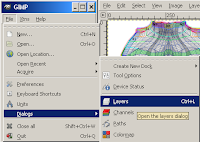
You will also need both the Layers and the Colors (or FG/BG) dialog. If your Layers dialog is missing, re-create it with Dialog->Layers from your Tutorial Shirt window, or File->Dialogs->Layers from the main Gimp window. If your Colours (FG/BG) dialog is missing, recreate that with Dialog->Colors or File->Dialogs->Colors.

Theory

The first thing to do is to look into the theory of highlight and shadow. The theory applies to everything you do - clothing, skins, tromp l'oiel (trick the eye) designs for building - everything.

A highlight is a place where the sun or some other light falls directly on a surface. This makes the surface appear paler than the surrounding region.

The shape, colour and intensity of the highlight is affected by the shape, colour and texture of the surface, and the shape, intensity, colour and distance of the light shining on it. Candlelight on a nearby mirror looks very different than sunlight on a velvet jacket.


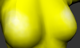
In a shirt, you normally find highlights around the collarbone, on the shoulders, on the top surface of a woman's breasts, on the top surface of a fat or pregnant belly, and (in a muscle shirt) on the top surfaces of very impressive muscles.

In the tutorial, we're going to assume that light is coming from above and slightly to the right, that it's a distant light source, and that it's a white light. Towards the end of the tutorial, I've written a brief section on other light sources and colours.

Open your tutorial shirt again.


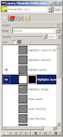
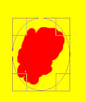
The first step is to decide where the highlight goes. I usually do this with a couple of contrast dots or smears on a new layer - so make a new layer. Call it 'Highlight Guides' or something similar.


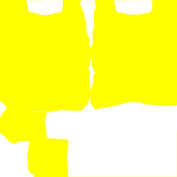
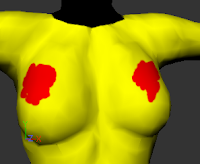
We'll put a highlight on the top surface of the breast for this shirt (the placement for this is more forgiving than for the others), so on the new layer, put some red smears on the top surface of where you think the breast is. Since we're assuming the light source is slightly to the right as well, have them curve slightly to the right side of the top. See my smears for guidance.


You can use any drawing tool for this - I used the paintbrush. Don't bother about making it look pretty, it's entirely for you & won't be in the final product.

Upload them to your avatar-clothing-checking-tool (see Part One) and check that the smears are in a good place. There is no perfectly right place, just one which looks good to you. Keep adjusting the position until you find one that works for you - it usually takes me several tries, and I'm experienced at it.


Now you're ready to start adding highlights! In this tutorial, I'll show you several different methods - as you get practice and get used to the techniques, you'll use different methods for different purposes.
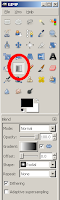
Airbrush

Start by making another new layer, this one called Highlights: airbrush. Select the airbrush tool, and select white as the colour. We'll start with making white highlights, then I'll show you how to make pale yellow highlights with the airbrush instead.


In the settings section of the airbrush dialog, choose a large fuzzy brush. Play with the scale, rate and pressure settings, and try to paint a white patch over your red markings, with the centre not being fully white (it should still show some red - or pink - through), and the outside being barely white at all. Try to make it fairly smooth. It's okay if you overlap your red regions too.

Using a lot of small, short strokes is easier than trying to use large sweeping repeated strokes. Small short strokes also lets you make liberal use of Ctrl-Z (aka undo). In fact, you don't even need to use strokes. I often just place the airbrush and click without a drag.


Don't worry if you can't get yours looking like mine. Blur, smear, and transparency will fix it a lot. My settings were a size 19 fuzzy circle, scale 1.54, rate 30 and pressure 7. Also, save your work several times during your painting!

When your highlights are painted, click on the eye against the 'Highlight Guides' layer to make it invisible, and save your file to a png or jpg. Load it into your clothing previewer and take a look. It might look a bit like this.


Now make the highlights guides visible again, and make a new layer. Call it Highlights: airbrush yellow. We're going to compare the result of a white highlight with a pale highlight of the same shade as the main shirt.

To get the shade of the main shirt, we'll use the dropper tool. Select your shirt layer (mine is 'shirt base colour', and select the tool that looks like an eyedropper.


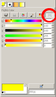
Go to your colours menu, and select the sliders tool. The S slider is 'saturation'. At present, the yellow is highly saturated - very strong. Move the slider about three quarters of the way to the left, to where it's very pale but still distinctly yellow. (There is no 'right' or 'exact' placement, just whatever looks artistically appropriate to you.) I moved mine to 30.

For some colours, you'll want to adjust V (value) as well as or instead of S (saturation). Keep H (hue) the same, though. Ignore the R(ed)/G(reen)/B(lue) sliders for this purpose: it's easier to adjust only the lightness or darkness of a colour if you use HSV. (RGB is great for other purposes.)


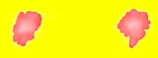
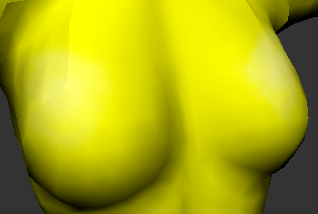
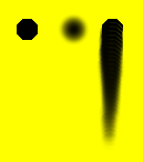
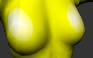
Now paint with your airbrush the same way you did with the white, getting much the same effect. When you try that on your clothing previewer, you should get something rather like the image to the left. The pale yellow produces highlights which are weaker than the white highlights. (You may have noticed as you were painting over your red that it produced an orange/yellow tint. You can use coloured highlights to simulate a coloured light source. That's an advanced technique, but this is how it's done.)


You can make the white highlights weaker quite easily, if you want to. Simply go to the layers dialog and adjust the opacity. If you turn the white's opacity down to about 70%, it should be similar in strength to the yellow highlights.


If you're not happy with how smooth your highlights are, you can use two tools to fix that. They are the blur and smear tools.


The spot on the left is what all three looked like. The middle one has been repeatedly blurred, the one on the right repeatedly smeared. I make use of both blur and smear to help smooth everything - highlights, shadows, wrinkles, any edge that I don't think should be sharp - anything.


Don't forget to play with the settings. Opacity, brush type and (for blur)scale are particularly useful. In Blur, 'Sharpen' is a kind of anti-blur. Make a spot and play with repeatedly blurring and sharpening it to see what both do.

You really do learn best by playing with the settings. Turn them up and down to max while playing, but when actually using them on something you want to sell, be sparing with how far you push the slider.

Spend a bit of time using blur, smear, and the transparency setting to get your airbrushed highlights looking kind of nice, then we'll move on to dodge and burn.
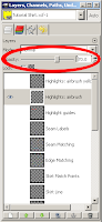
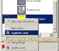
Dodge and Burn

While the airbrush adds a new colour, the Dodge and Burn tools modify an existing colour. So for this, find the Shirt Base Colour layer, right click on it, and select Duplicate Layer. Use 'Edit Layer Attributes' (also in the right-click menu) on the new copy to rename it 'Highlights: dodge'.


Dodge lightens the image, and Burn darkens it. Naturally, this means we use Dodge for highlights, and Burn for shadows. Opacity, Brush, Scale and Exposure operate the same way they do for the Airbrush. Mode (with the Shadows, Midtones and Highlights options) is special: it determines which colours in a multi-coloured image are affected. 'Shadows' makes Dodge/Burn affect only the darkest colours, 'Highlights' only the lightest, and 'Midtones' everything else.


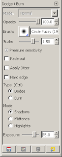
In my experience, you need to have Shadows selected to make Dodge affect a single-colour image; and Highlights for Burn.

Make your Highlight Guides layer as transparent as you can while still being able to use it to see where you want to put the highlights, and move it to above the Highlights: dodge layer.


Then select the Highlights: dodge layer, and use the same sort of small strokes and painting pattern you used with the airbrush. Build up the same sort of highlight. You can use smear and blur with dodged highlights just as you can with airbrushed.

As with the airbrush, build up your highlights, save the file, save as a png or jpg and upload into your previewer to have a look.


There's a special trick I like to use to make the dodge/burn highlights and shadows layers contain only the highlights and/or shadows, however. I go to Select By Colour, set the Threshold to 0, select the base colour, and then cut that colour out of the highlights (or shadows) layer. This lets you use the Opacity slider and affect only the highlights (or shadows).


Layer Masks/Alpha Masks


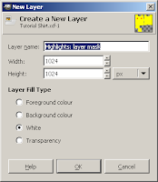
The Gimp also allows you to have selective opacity within a layer. So you can make a pure white (or pale-coloured) layer, then use a 'Layer Mask' (also known as an Alpha Mask) to make it selectively opaque.

Create a new layer, call it 'Highlights: layer mask', and make the Layer Fill Type white. Right click on that layer and select Add Layer Mask. Initialise the layer mask to 'full transparency'.

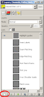
Now in the Layers dialog there are two squares in the 'Highlights: layer mask' layer. The left one represents the layer itself, the right one represents the mask.


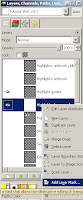
To work on the layer, you select the left square. To work on the mask, select the right square. Confused yet?

Painting the layer produces the image in the layer. Painting in the mask makes certain parts of the image selectively visible.

The mask should be all black and white. The parts which are black become invisible in the image, the parts which are white become visible in the image. Like the mask is exactly that - a piece of black paper with white holes which reveal the image below the mask.

But the mask is smarter than that - you can use shades of grey. Dark greys are less visible, pale greys more visible, until you get to the ultimate black or white invisibility/visibility.


So we have a white layer, and we're going to paint the mask to reveal gradual amounts of the white.

(Yes, it would be just as easy to paint white on a separate layer of the image - but in future, you can use this same technique to selectively reveal a more complex image than a pure white layer. It's often used for a 'fuzzy border' effect in a photograph, for instance.)

So select the layer mask. The blue band should be across the Highlights: layer mask row in the Layers dialog, and the white border around the black layer mask.


You need to paint white or shades of gray over the place you want the highlight. You can paint with the airbrush, the paintbrush, the pencil, the ink tool - anything you wish. You can use blur and smear to make it smoother. In this case, however, I'm going to show you yet another nifty trick.


Gradient (also Layer Mask continued)

Make the two colours in your toolbox black and white (use the little arrows to switch between them, and the colours dialog to select black/white as necessary). Go to ellipse select, and select a rough circle shape over one of your highlight guides.


Select the Gradient tool and the Radial shape. Click in the rough centre of your selection, then drag to a bit beyond the edge of it. This will create an invisible-to-you graduated set of shades of grey on the layer mask, limited to the selected ellipse. What is visible is the effect on the layer itself: a set of gradually more (or less) opaque white shades.


As you can see, this could use a bit of work with smudge and blur. But the principle is sound.

You can use Gradient as a tool on its own - it's not limited to use with the layer mask. Instead of going from black to white, however, go from the garment's base colour to white.

Eyedropper, Paintbrush, Pencil & Ink

As an advanced technique, once you have some practice using the automated blending tools, you can do your own blending. A useful trick is to use the gradient to make a nice long line of highlight colours (from the base colour to white), and then use the eyedropper to select different shades from the gradient. Then you use the paintbrush, pencil or ink tool to paint the shades in where you want them.

Make a new layer, transparent, labelled Highlights: hand painted. Make the two colours in the tool box the yellow of the base T-shirt, and white.


On a part of the layer that doesn't cover any of the UVs, make a rectangle selection.
Select the gradient tool, make the shape Linear, and drag from one end of the rectangle to the other. This will give you a rectangle of various shades of yellow, grading evenly to white.

Now you can use the paintbrush, pencil, and ink tool - or the other tools - and try to make a nice smooth even blended highlight like the other ones we created with the other tools. Use the eyedropper to pick up colours from the gradient rectangle you made.


This is something to use when you have a good eye for highlights and shadows, and can see that you need this exact shade in that particular place.


Shadows


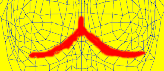
Shadows are drawn exactly the same way highlights are. Instead of using paler colours, you use darker. Black or dark gray instead of white and pale grey, deeper versions of the base colour instead of lighter, Burn instead of Dodge. For a gradient, draw from the base colour to black rather than to white. For the layer mask method, use a black or dark layer.

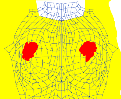
The shadow guides for the female bust should look something like this.

Other layer types

Don't restrict yourself to 'Normal' layers. If you look at the layers dialog, you will see that layers have a wide range of types.

The 'Soft light' layer type is great for highlighting - it produces a very vibrant look where the white is in the layer. Contrast that to the 'powdered' look highlighting with white can create.

'Overlay' is excellent for a highlight/shadow combination layer.

Create yourself a set of light and shadow layers and experiment - I don't yet fully understand what each of these is supposed to achieve (I'm still learning to use them myself).

The ones I'd recommend (at this stage in my own learning) for highlight and shadow effects are 'Overlay', 'Dodge', 'Burn', 'Soft Light', 'Darken only' and 'Lighten only'.

But play with the others. If for no other reason than fun!


Other light sources and colours

If the human body is being lit from below, the normal highlights become shadows, and the normal shadows become highlights. But most of the time in SL (or in other forms of art) clothing and skin is highlighted as if the light is coming from above. Often, lighting is presumed to come from a distant light source that's above, in front of, and slightly to one side of the item of clothing or skin. The lighting is also usually presumed to be white.

You can see this effect in RL by having a friend stand in a dark room, and turning on a lamp. Put the lamp in front of him and above him, and see what parts of him are most strongly lit, and what is most strongly in shadow. Then put the lamp directly in front of him but not above, and see how the lighting changes. Then below him. Then try with the light behind him, or to one side - just keep moving the light.

Clothing for Gothic and post-apocalyptic settings is often made as if the light is an unusual colour, and coming from an unusual direction. Some ethereal or faerie clothing is made with blue- or green-tinted lighting effects.

Get some coloured cellophane or coloured light bulbs, and experiment with lighting that patient friend of yours with different colours and from different directions. If your friend is really patient, get some more lamps and play with intensity of light and multiple light sources.

For an infinitely patient friend, use your SL avatar as the friend - you can make your lights by using the 'Light' feature in the 'Features' tab of a prim's Edit window. Plywood spheres make perfectly adequate SL lights.
Just make sure you have Local Lighting turned on in Edit->Preferences->Graphics (tick 'custom' to see all the options).

Move on to part 4, Seams.

Moving files to and from SL

Download

Downloading is taking a file (in this case an image) from the distant site (SL) to the local site (your computer).


To download an image from SL, open it from your inventory. This should get you a window like the one in the image to the right.

Then go up to the File menu on the left of SL's top toolbar. You should see 'Save Texture As...' as an option. Select that. You can now select where on your hard drive you want it, and SL will download the texture to your machine.


Upload

Uploading is taking a file (in this case an image) from your local machine to the distant machine (SL).

You must have at least 10 Lindens in your account to upload. If you don't have the money, the upload options will not be available in your File menu.

If you do, you will see 'Upload Image', 'Upload Sound', 'Upload Animation' and 'Bulk Upload' listed in your File menu. All uploads cost 10 Linden per file.

Select the appropriate option (clothing, skins, textures and photographs all count as images), and you will get a dialog asking you to choose the file. Find the file in your hard disk and click on Open.

Uploading an image provides a window which shows you the image, with a dropdown menu allowing you to preview it as a clothing item. If you are happy with the image, select Upload. All uploaded images are of type texture: to get a type 'snapshot', see the special case below.
Uploaded images appear in your Textures folder.

Uploading a sound provides a window which lets you select the bitrate. Unless you specifically want something else, stick with the default there.
Uploaded sounds appear in your Sounds folders.


Uploading an animation is the most complex, the preview screen for the animation doesn't just provide a preview, but controls most of the animation options. At some point I will write a tutorial about making SL animations, and I will discuss this upload screen in that tutorial (and link to it from here).
Uploaded animations appear in your animations folder.

Bulk upload lets you upload any file type, but without the previews. I don't recommend it for animations, but I frequently use it for images.
Bulk uploaded files appear in the folder for their type.

Special case: Snapshots


Snapshots - or photographs - can be either saved to your hard drive or uploaded direct to SL.


Snapshots only get the photograph icon if they're uploaded directly to SL from the snapshot screen, in all other cases they have to be uploaded as images and are treated as textures.


You determine whether to save your snapshot to your hard drive, upload to SL, or send to another person (via email) with the three radio buttons at the top of the snapshot preview.

The options below vary depending on which radio button you choose. Saving to your hard disk provides the same file selection browser as downloading a texture. Upload will upload the snapshot to SL, costing you 10 Linden and giving you the image in your 'Photos' folder with a photograph icon. 'Send' will ask for your email address and send the photograph to the email address provided.

If you're taking a lot of photographs (such as modelling clothing) and want to save them all to your hard drive, use CTRL-`. (The ` is the form of apostrophe under the tilde ~ key in the US-style keyboard.)