Thursday, October 29, 2009

Temporary moratorium

Feldie (Feldspar Epstein) is helping me migrate my blog to tateru.nino.net, and a nifty new CSS-y template that will let me be more certain images are beside the relevant portions of text, and all sorts of neat stuff like that.

However, she would like me to avoid writing thirty new tutorials for her to migrate while she's working!

So I'll focus on my shop stuff, some animations I promised for Gianfar, and my NCI work, for a little while. Then tutorials will resume.

Tuesday, October 27, 2009

Changing my permissions

In the past, I've provided many objects full perms. Unfortunately, some people have taken to using full perms items as a way of concealing their culpability in making collections of stolen goods, or making griefer tools.


If you receive an item which purports to be from me, but doesn't seem like my usual style, do not trust it!
Also, do not trust a scripted item which claims to be from me, but did not come from one of my stores*, Xstreet SL (with me listed as the seller), NCI, Primwynly or Twisted Thorn Textures.
* My stores are listed in my profile picks, and on this blog.

Unfortunately, this means that as I change things over, those will be the only places from which you can get my full perms freebies. Some no-mod/copy/transfer items (especially information notecards) will continue to be available for free duplication and spreading around SL.

Regrettably, I have to recommend to other creators of freebies and useful items that they do similarly. This is, quite frankly, dreadful because it limits how easily people can spread innovations.

I recommend that scripters who want to share knowledge make use of the scripting library forum at http://forums.secondlife.com/ - this way, the information is there, but if someone abuses it and creates malware, your name is not on it.

Provide goods for sale as "copy/no transfer" or "no copy/transfer" - modify or no modify as you prefer, though think hard before making cheap "modify/no copy/transfer" items.

Provide freebies as "modify/copy/no transfer", "no modify/copy/no transfer", or "no modify/copy/transfer".
When providing full perms freebies to centres of freebie-giveaways, such as New Citizens Inc or The Shelter or Yadni's Junkyard, ensure that the person you are giving it to knows which permissions you want it distributed as, and will change them accordingly.


Note that textures and sculpt maps have to be downloaded to be modified, then re-uploaded under the modifier's name. Animations and sounds can't be effectively modified. Thus, all of those are safe from the malware-with-you-as-creator problem, though the reselling problem is still there.
Unfortunately, I know of no way to protect items sold as components - they have to be at minimum copy/trans to be useful. I hate that.

The goal is to reduce the likelihood that someone will get an item of yours that is both modifiable and able to be given away: only one of those sets of permissions fits that bill, and they have to buy each and every copy.

Items which are not modifiable and able to be given away are safe to be out with your name on, even if they are both copy and trans, since they can only be given out in the original condition.
Items which are no trans can be modifiable, because the modifier cannot then give it out. (It is possible that the owner can make a griefing tool from it with your name as the creator, but the Lab can compare that with other copies of your item and see it for the blatant lie it is.)

I really, really hate having to look at my products and worry about how they might be misused. And I hate having to advise you all to do the same. But alas, no world is perfect.

Wednesday, October 14, 2009

Tileable Textures


Lane Luke made these great fruits - a persimmon and a pomegranate. They look fantastic, don't they?


Now let's turn them around. Oops.


Lane asked for my help - and was generous enough to offer to wait while I made it a tutorial for everyone. :) Kudos for Lane! So let's use Lane's problem as an example for the common problem of texture tiling.


Here are Lane's textures for the fruits. As you can see, the right and left sides of the textures don't match at all.

Note that both the textures and the sculpts themselves belong to Lane. You are licenced to use the textures for study purposes, but not to sell either as textures or as part of an object. Please respect Lane's generosity in providing these as examples.

You can test the edges of the textures (if you use these ones) with a sphere: the results, while not identical to those in my 'final' images, will be quite similar.


Back to the problem. There are several ways to fix the left/right disparity. One method is to use the Gimp's 'Tileable Blur' feature. You find this in "Filters->Blur->Tileable Blur". For this purpose, you want horizontal blur only (we're not trying to wrap the top to the bottom, just the sides to each other).


It helps, but not enough. A wider blur will help more, but will also blur details in the fruit texture. Using the tileable blur tool is always a tradeoff - it's up to you how much you want to trade.


But there are other options.

The one I prefer is fairly simple in concept. I divide the image in half right/left, and swap the halves.


This puts the bad edges together in the centre of the image where I can play with them with smudge and blur tools and smooth them out to make them look right.


Here's the persimmon, first straight, then swapped, so you can see what I mean.


To swap them, first grab a guide with "Image->Guides->New Guide (by percent)".


Use a selection rectangle and let the rectangle snap to the guide, then select the entire left side of the image. Copy the selection, then paste as a layer with "Edit->Paste as->New Layer".

Then do the same with the right side.


Your layers dialog should now look something like this. (Note that I have two copies of the original image - I always keep a second copy, in case I screw up. It means I can always start fresh.)


Select the alignment tool. Click on the left half-image, and use the alignment tool to push it right. Do the same (in reverse) with the originally-on-the-right half-image.


One trick with the alignment tool is that it selects the topmost visible part of the image under the cursor. If you end up with the half-image you want to move underneath the half-image you've already moved, use the 'eyes' in the layers dialog to make the top one invisible while you move the bottom one.


Your image should now have the right half on the left, the left half on the right. You should have two pasted layers in your layers dialog, one for each half. Right click on the top one of the two and select "Merge Down" from the menu that appears.


This will give you one layer, with each half swapped. Duplicate this layer (right click on the layer in the layers dialog, and select "Duplicate Layer") to ensure that if you mess up, you can just duplicate that backup and try again.

The guideline in the middle might bother you. (It often bothers me.) Go to View->Show Guides and untick it.


Now comes the part where if you don't have a drawing tablet, you decide to hit ebay and see if there's a cheap one. Mostly because this part is easier with a tablet than without one.


Study the image you're planning to make tileable. Look for patterns of light and shade, and decide where the light should flow across the border, and where the shade should.


Using the smear tool and the largest fuzzy brush, roughly smear the light and shade across the border. There is no 'right' or 'wrong' for this, just whether it looks natural or not.


Using a smaller fuzzy brush, smooth some of the roughness in the early smears, and try to 'soften' the edges between shades of colour.


Upload this stage to SL (using the preview grid or the temporary upload feature of some of the third party clients) and see how it looks before you move on to the next stage. (Note: the 'seam' will be on the other side of the prim - you may want to either look at the other side of the prim, or offset the texture horizontally by 0.5.)


While this looks a lot better than the original, I think the lower dark patch has extended too far into the light patch. Personal taste. I'll smear that away. This sort of personal taste thing is why I recommend checking it in SL at this stage.


From this point, you just use smaller and smaller fuzzy brushes to smear the edges smoother and smoother until you like how it looks. You can also use the 'blur' tool, once you have the major colours in place and need only to blend the edges into each other.

In the detailed brown part at the top, only use the small brushes - otherwise you'll lose the detail.


During this stage, upload to SL every so often until you're happy.


I can't give you exact instructions - it's very dependent on your personal artistic view.

Above are the original and final persimmons, and to the left is the final texture.


So now what about the pomegranate? Look at all the detail you'll smear away if you treat it like the persimmon!


Start the same way. Split it in half, put the outer edges together. Get to the stage where the texture looks like this.


Now protect all that lovely detail. Duplicate the swapped layer, so we can play with it later. In the duplicate, go ahead and smear just like you did for the persimmon. Don't worry about losing the detail - we'll get that back later.


Once you're happy with the smearing, we can restore the detail. Move the original swapped layer above the smeared layer, and make both visible. With the original layer selected in the layers dialog, set it to the layer mode "Difference" (there's a dropdown menu at the top of the layers dialog). Select "Copy Visible" from the Edit menu.


Use "Edit->Paste as->New Layer". Make the original swapped layer invisible again. The new layer you just pasted should be black, with reddish parts and greeny-white parts.


This layer contains - surprise surprise - the differences between the unsmeared and smeared layers. Which means it has all our detail! Unfortunately, it also has all the unsmeared background as well.


To see what we're going to do, set that new layer to 'Addition' mode. You'll see the original unsmeared version of the swapped layers show up. All we need to do now is remove the bits of red that replace the smears.


I wish it was as easy as just selecting the red parts out - but set the new layer back to 'Normal' mode and study the red. In some sections, the detail is all different shades of red. I experimented with a bunch of options, and here's what I came up with.


Go to "Colors->Levels". Select the Red channel, and play with the input and output levels. This removes the red tones, bringing them down to blacks and greens. You want to get as much of the reddish background to black as possible, while leaving the detail in greens and pale tones.


Now we make this reddish again (the former background red will stay black, only the greenish/whitish bits will go red). Go to "Colors->Colorise" and change the hue down to a red shade - somewhere between 0 and 15. To keep this from becoming intensely bright, bring the saturation down as well. I chose 20.


Finally, set the mode to Addition. This should give you a pomegranate texture with lovely detail and smeared-out lines.


There is still one minor problem: you will notice some slight seaming where the details abruptly change. Fixing that has to be done the tedious way of zooming in and using cut/paste or pencils/paintbrushes to put details from one side of the seam into the other side of the seam. But at least you have most of the work done!

Friday, October 9, 2009

Using a pre-made texture in SL clothing

This is a more advanced technique, that belongs in the "Making a Tshirt" part of the "How to make SL clothes in the Gimp" tutorial series, but which I fear might confuse total novices if I put it in there directly.

If you haven't read any of that series, you can start at the beginning.

Click here for the exact position of the "Making a Tshirt" tutorial that this mini-tutorial fits in.


1. If the texture is in SL, download it to your hard drive. Open the texture, go to the File menu (up in the top left of the screen), and "Save Texture As..."


2. Open the texture in the Gimp, and paste it into your image as a new layer; or if you're making it from scratch, create it in the Gimp on a new layer.
You may need to 'Scale Layer' to make it the correct size. You can find that in the Layers menu.


3. Go to the 'tshirt' shaped layer of your image. In part 2 of my tutorials you can see some clear pictures of that layer. Make sure to select this layer in the layers dialog.


4. Use 'select by colour' to select the transparent parts of that image: we're doing that to tell the Gimp what to cut away from the texture layer.

5. Move to the texture layer.


6. Use 'cut' to cut away the selected parts from the texture layer.


7. Turn off the colour layer (you won't need it now) (don't delete it - you might want to use it again for a later texture.)


8. Proceed as stated in the rest of the tutorial.

Wednesday, October 7, 2009

How to make SL clothes in the Gimp (part 4)

In part one, we collected the tools we'd need to make clothing. In part two, we made a basic shirt with no features. In part three, we added highlight and shadow.

NOTE: Enough people have expressed their hope that I get this one finished soon, that I'm putting it up half done. The images will be done soon, in the meantime, feel free to read the text.

In this tutorial, we'll cover seams - both sewing and avatar seams. Wrapping flat pieces around a rounded body creates seams, whether the flat piece is fabric or a digital piece of art.


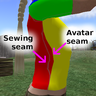
Avatar seams are the seams that inevitably happen when we match the front and back of the UV maps together around the avatar. I've coloured each UV map section a different colour, to make the avatar seams more visible.


Sewing seams are the representation of seams down the side of fleshworld clothing, and at the shoulders, the hemline, the collar, and everywhere else the fabric is pieced together.
In the example photo, the animation has distorted the avatar shape in this image - usually that seam will hang vertically. The sewing seams are the faint grey fuzzy stripes under the arm, and down the side of the body.


Avatar Seams

Avatar seams are the places where the UV maps meet.


The front torso meets the back torso, both of those meet the head map, the head map has a seam down the back of the skull. The arms actually have a kind of 'top and forward' part, and a 'bottom and back' part. The torso meets the hips, and the legs have front and back sections as well - and the feet are yet another piece.


These seams can look ugly and messy - or can be invisible. Most clothing and skin makers try to make them neat, at least. I like to not just make them neat, I like to conceal them.

Not everyone agrees with me. Some designers point out that it's a fact of life - the seams exist, we have to just accept them. I feel that if you can hide them, your products look better for the effort.

Edge Matching


Robin (Sojourner) Wood's and Chip Midnight's clothing templates have edge match guides. Using those will get you very close to a perfect match, but I've never had a pixel-perfect match from those.

I make the garment using the templates to get close to a match, then trial it on a clothing previewer. I then shave a few pixels off the longer side, or add them to the shorter side, and try again. Yes, it's tedious, but it works.

Another thing to be aware of is the fact that the avatar mesh stretches and shrinks when the shape changes. You will get the neatest edge if you design your clothing so that the avatar seam is crossed on a line in the mesh, not in one of the gaps.

FIXME: show crossing a seam on a line, show crossing a seam in a gap, show on two different sizes.

Wear the various shapes in the Designer's Toolkit while previewing your clothing, to see how your avatar seams look on the various shapes there.

Pattern or Design Matching

If you're using a fabric with a pattern or design, making the avatar seams match is one of the trickiest things to achieve. If you can pull it off, it's fantastic and I salute you. (I usually try to!)

FIXME: Show the Rowan design match.

Some are easier to match than others. When I'm making an abstract, like my Rowan leather outfit, I play with airbrush and smudge and cutting and pasting to make the seams look as if they match.

FIXME: Show the Cameron belt pattern match.

With the Cameron belted pants, I could hide the 'broken' repeats under the belt overlap: and noone expects a belt to repeat a perfect number of times around a human body anyway.

FIXME: image where design carries across av seam, breaks on sewing seam

Another option is to carry the design across the avatar seam and break it on the sewing seam. This not only disguises the avatar seam, it attracts attention to the intentional detail - the sewing seam - instead.

When I'm doing this, I start by cutting and pasting - I put the design on one side (usually the front), and lay the UV map over the top of the design layer.

FIXME: image of this stage.

Then I look at which part of the design crosses the UV map outer edge, and paste the design onto the other side (usually the back) so that, as far as possible, the design crosses the UV map at the same point.

Side note: Planning to have a centre back sewing seam is VERY useful when you're trying to match the side seams, by the way. If you're doing this, work with a different layer for each side of the back, so you don't wreck the left side while you're placing the right.

The paste is never completely right - you're going to have to modify the back to make it fit properly. So preview the garment with the approximation, and notice where you'll need to modify it.

FIXME: try to make an image showing modifications.

Usually, the modifications are just extending or shrinking the pattern enough to make it look almost right. Imagine that you're fitting a lycra swimsuit on a particularly curvy woman - think about how the patterns on such a swimsuit are stretched or shrunk when you look at it.

Once again, the key is experimentation, trial and error.

Sewing Seams

We'll be using the tutorial shirt again. This time, we'll be drawing in the sewing seams.

Try to design your main sewing seams once, and use them over and over again for different garments. Well-fitted, well-sewn garments almost always have the same key set of seams, with variation only for different types of garment construction.

Standard seams

FIXME: diagram of standard seams

Side seams in a well-fitted garment should fall vertically from the armpit to the ankle, down the line that starts from the point of the shoulder. (Almost as if you'd dropped a plumb line from the point of the shoulder.)

The centre back seam should also look as if you'd dropped a plumb bob, this time from the top of the spine.

Seams across the shoulder should go from the point of the shoulder to the one on the other shoulder, as if there was no head or neck in the middle (but, of course, interrupted by it!).

The armhole seam has the most variation of the 'standard' seams. However, the 'default' armhole sleeve starts at the point of the shoulder, drops vertically down the front and back until the halfway point, then curves smoothly to meet under the armpit, only a short distance below the actual meeting point between arm and body.

The crotch seam is another which can have a great deal of variation, but the SL version is a lot easier than the atomic-world version! In SL, just draw the crotch seam as a vertical line down the UV mesh - any shaping it needs happens automatically when you modify the 'pant looseness' slider.

Finally, all the cut edges of the garment need to be hemmed, unless they're on a selvedge. So draw in hem seams, or make a slightly different coloured edge to represent selvedge.

FIXME: make a diagram of optional seams

Variations on seams

Both Feldie and I sew, and we have fashion design books that contain diagrams of the many, many seam and garment construction variations that exist in the world. I strongly recommend hitting your local library (yes, atomic-world library rather than digital) and at least flipping through the pictures.

The diagrams you want will look something like this.

FIXME: diagram showing sleeve types, or cuff types, or bodice variations, collar variations. Maybe a blend of several.

I looked for similar diagrams online, and haven't found any. If anyone does find some, please add the URL to the comments.

Drawing seams

Once you have decided where on the body the sewing seams should be, make only the UV map layer and a white background visible. If you're doing hems, edges, or anything where the outfit outline is important, include that as well.

I find it's easiest to do seams without any distracting details.

Make a seams layer. If you're like me, make a bunch of seams layers and do each seam set on a different layer. If 'too many' layers confuse you, just have a single seams layer.

FIXME: example of seams 'placement' layer over UV maps and shirt outline.

Draw a marker where you think the seam should go. A line about four or five pixels wide will do fine. Bright red if you want it to show up clearly. This is just for placement: it's not the final seam!

Next you spend ages flipping between your previewer and the Gimp, working out that this part of the seam belongs between those UV lines. Don't worry that it looks wonky and distorted on the flat page - make it look right when wrapped around the avatar framework.

Finally, once you've placed your seams, make another new layer. Above the red line of the seam placement guides you've made, draw your seam.

FIXME: examples of both types of seam

I like to make a path along the seam line, then use the airbrush with one of the fuzzy brushes, and a dark grey. When I'm making a light garment, I make the seams layer mostly transparent. With a dark garment, I leave it more opaque. This way I have a bit of shadow along the seam line, but it's not overwhelming for the garment.

If you want to go into detail, try making a line of highlight, a line of shadow, and some 'stitches'. Make sure the highlight is where light would fall on the slight 'bump' where the seam rises, and the shadow would be in the slight 'dip'. Study atomic-world clothing seams, to get the exact placements.

For even more suggestions, check out the thread on seams from the Texturing forum.

And don't think you're finished yet! Preview your seams. You'll find that in some places (such as the crotch) the seams are stretched all yuck. And in other places, they've been shrunk narrower.

Again, there is no magic bullet. Modify, preview, modify, preview, rinse, repeat until done. BUT! Once you've done it once, you'll be able to use the same seam layer on many of your clothes - and use it as a template for other seams on other clothing!

FIXME: seamed, patterned shirt seen across the side-seam, showing both concealed avatar seam and sewing seam.

And .. that's it. That's how to put seams on clothes.

Tuesday, October 6, 2009

Pain Management Aftermath

The pain management program had four more weeks, with different fellow sufferers. A is a comedian, larger than life and with a theatrical way of talking and behaving. M is a fairly withdrawn man, very quiet but when he does speak he's been thinking about it. V is gorgeous, a lovely woman with myriad medical issues, who has led an amazing life.

C had surgery, which has left her in pain and with nerve damage to her foot, she started the program with a tendancy to obey doctors and believe in them having authority. By the time I'd finished, she'd decided that she'd delay the further surgery her surgeon wanted, and was working with our physiotherapists to regain proper function in the foot - and was having significant success there!

The physical side of the program got harder and harder, but kept just below the point where I would begin to flare. At the end, I was doing the hydrotherapy with resistance boots with fins in all directions, and finned water dumbbells. I moved to the weights, and then to free weights, in the dry land physiotherapy.

The other subjects were much the same - oh, different topics for each week, but still the same basic thing.

I finished the program a lot healthier and more functional physically - and exhausted and emotionally drained.

Then we tweaked my medication. I'm still in the 'let's try to get this right' medication adjustment phases, and feeling like utter crap. But the long term benefits should be worth it. Right?